Welcome. Enjoy The Art Here.
All the art is listed from most recently completed all the way to the first art that I designed.
Each piece tells a story that in some way connects to other pieces that I have done.
Each piece tells a story that in some way connects to other pieces that I have done.
Select artworks pictured here are for sale. To get pricing information, contact: [email protected]
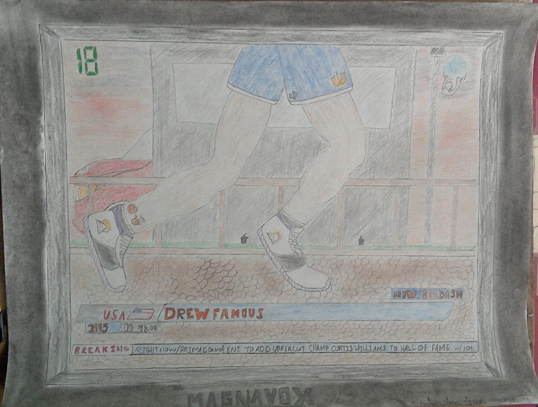
Drew Famous & 1995
"800DASH"
May 25, 2018
Behind The Art:
When the album name was announced, I had originally wanted to create a piece that was a reference to the Toyota FR-S in the arts for Adrian Stresow's "At Least I Tried" and Andrew Mulat's "LOSER!". The art was going to be of the speedometer showing the car going 800 mph with other little details but I decided to use that idea on another project for another time. I then had an idea to reference Drew's last two projects ("Yearbook and "Running In Place") by drawing a collegiate sports locker with a graduation cap (the "Yearbook" reference) and a pair of Vans sneakers (the "Running In Place" reference". The sneakers are actually on the artwork for his single 'Floating' which is the last song on the album.)
As a matter of fact, I had started working on the idea when I had the idea to change it to something that would reference previous artworks that I have done. As I thought about what to change it to, I looked up at the artwork for Andrew Mulat's "LOSER!" and got the brilliant idea to use the TV in the building's room as the platform for the viewer (you and me) to watch Drew run the '800 DASH'. I snapped a picture of my old boxy Magnavox television and set to work. While this piece may look like the busiest, it's actually simplistic in its design.
There is a reference to literally every song on the project. The shoes on the person's feet (the person is actually Drew himself which is a reference to the song 'On My Own') are based off of the Vans in the 'Floating' artwork and the shoes in the "LOSER!" artwork. I wanted to give a shout-out to the graphic designer who did the actual art for '800DASH' (the art is designed by the legendary Kevin Hackett) so I put a semi-circle banding on the sneakers as a subtle reference to Kevin's clothing brand Culdesac. The path Drew is running on (another "Running In Place" reference) is based on a walking path in Virginia where Drew lives called Mount Trashmore (cool place; check it out sometime) and is also a reference to the "Yearbook" artwork (see the 3rd to last picture on the bottom right-hand corner for 'Mountain View' on the "Yearbook" artwork) and the "LOSER!" artwork. In the "LOSER!" artwork, Andrew Mulat is headed in the opposite direction that Drew is headed in. The black structure behind Drew is actually a bus stop that is 2 blocks away from the Mount Trashmore walking path. The red car is that Toyota FR-S which is now in 3 artworks. (In the "LOSER!" artwork, the car is on the road which leads to the bus stop that Adrian Stresow is sitting at in the "The Kid In His Room" art.) The small sign next to the stop is the bus stop sign. I reference producer 1995 and Drew Famous with the classic Olympic style lower 3rd with their names. The '00:43:00' marking next to 1995 was an approximation of the album's timing which turned out to be 6 minutes off (blame ITunes; they gave an estimated time of 43 minutes). In the 'BREAKING NEWS' running bar, I found a creative way to reference 3 of the songs (Right Now/Prima Donna, Uppercut and Hall Of Fame) and some of the featured artists. The '18' and the 'Apollo' logo in the upper right-hand corner are signifying the channel and the station the race is on. The lights on the television's frame are subtle references to his last two projects and '800DASH'. The two small black objects by Drew's feet are holographic sprinklers that are out of water (the reference to 'Drought Come'). The small tattoos on his right leg are a reference to the song 'Heaven and Hell'. The haze-y look in the background is a reference to the "LOSER!" art and a subtle reference to the rap group Illdaze who is featured on the album. I won't point out the rest of the references to the other songs as they should be obvious as you look at the piece.
This project took almost as long as the art for "LOSER!" but was much more involved. On a more critical note, in comparing the albums "Yearbook" and "800DASH", I feel that Yearbook had better songs in the way that they flow (even if you play the album in reverse) compared to 800DASH. I loved the production of 800DASH over Yearbook even though it has great production. I do personally feel that the number of features (although they are all good) detracts from Drew's verses and 1995's production. Other than that, 800DASH is a great project and is worth the listen! I enjoyed working on this piece and I hope you enjoy it as well!
Andrew Mulat
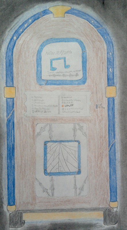
"UltraAVX"
May 19 , 2018
Behind The Art:
Once again, this piece is an art within an art. The jukebox sits inside the first floor of the building in Andrew Mulat's "LOSER!" art. The song selections are actually albums by artists that Andrew is associated with. The song playing is 'Jump' from the "UltraAVX" album and its design is based around a mashup of a song without a cover (as you would see it on ITunes) and the wavelength is from Soundcloud's website design. This piece took me about 9 hours to complete, making it my 3rd fastest piece that I have done so far. This was a good album but between you and me, I still think that "LOSER!" would have been better.
P.S. If you can somehow get me a copy of LOSER! I'd really appreciate it!
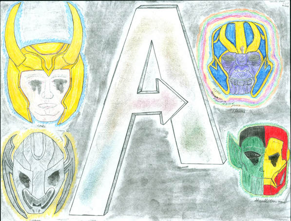
Marvel Studios
"The Marvel Cinematic Universe's Avengers"
April 27 , 2018
Behind The Art:
Story coming soon...
"The Marvel Cinematic Universe's Avengers"
April 27 , 2018
Behind The Art:
Story coming soon...
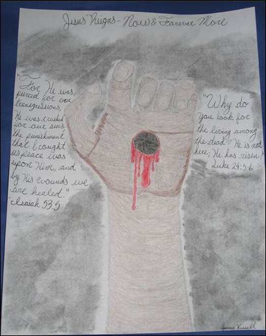
Spencer Russell
"The Hand of Jesus"
March 31, 2018
Behind The Art:
Story coming soon...
"The Hand of Jesus"
March 31, 2018
Behind The Art:
Story coming soon...
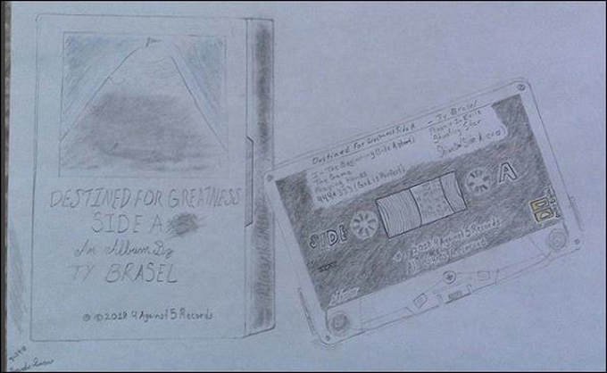
Ty Brasel
"Destined For Greatness Side A"
March 30, 2018
Behind The Art:
The story behind this one is really simple: I was listening to an old cassette and thinking about Ty's project when it hit me that 'Side A' was in the name of the album. So I stopped the tape, picked up the casing, and started drawing. The mountain on the casing was my way of saying, 'reach for the top, climb every mountain and be great'.This is by far the 2nd fastest drawing that I have done (the first being the artwork for Levi Hinson's "Alone") so far. This was a fun piece to do and I can't wait for 'Side B' to be released!
Adrian Stresow
"unknown album name" *UPDATE--Album Name "It Could Be Worse"*
*TBA*
Behind The Art:
Story coming soon...
"unknown album name" *UPDATE--Album Name "It Could Be Worse"*
*TBA*
Behind The Art:
Story coming soon...
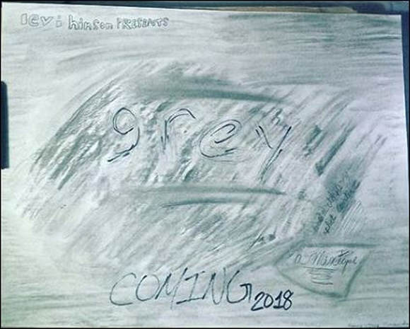
Levi Hinson
"Grey"
*TBA*
Behind The Art:
Okay. I'll be super short about this one. Levi said he was going to do a mixtape called "GREY" (he might turn it into an album now) and I had just pulled out a set of charcoal pencils that I had wanted to try out as I had never had use for charcoal. So I literally took the pencil and made the whole sheet grey then took a paint brush and made an outline of the word 'GREY' in the center. I added the words 'A Mixtape, Parental Advisory/Explicit Content, and COMING 2018' as general info on the project as there are few details on it. No word on when it will be coming out so stay tuned.
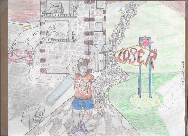
Andrew Mulat
"LOSER!"
Never To Be Released
Behind The Art:
Story coming soon...
"LOSER!"
Never To Be Released
Behind The Art:
Story coming soon...
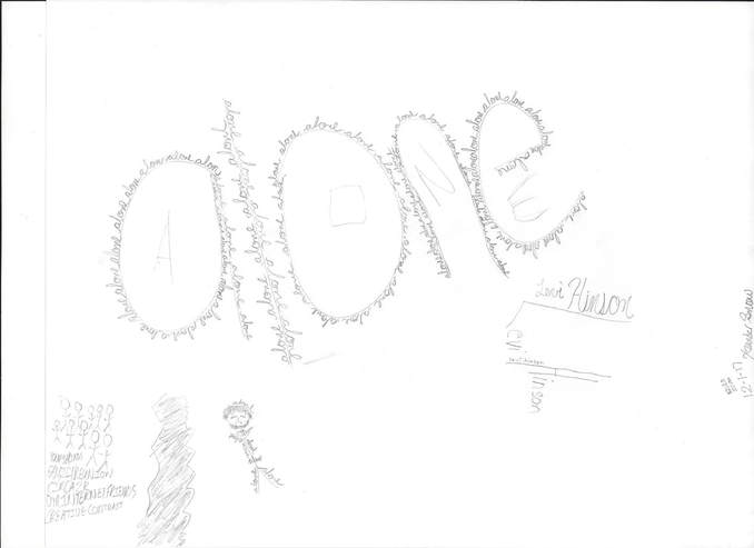
Levi Hinson
"ALONE"
December 17, 2017
Behind The Art:
Artist Levi Hinson posted a set of instructions on his social media pages
[ "@iamkevinhackett and i need your help for my next single cover. please email a drawing of the word "alone" written in any way you like to me at [email protected]."]
Easy right? I saw his post at 9:50 PM on Dec. 1, 2017 and started working on the art starting at exactly 10:00 and finished at 10:20. I started by writing the word 'alone' in big letters and then wrote the word over and over in cursive around each letter. I then put in Levi's name in cursive and then with the big 'L' and 'H'. And if you look closely, you'll see his name written on the long end of the 'H'. I was going to do a real person sitting in a fetal position crying but I'm not the greatest at drawing people (I do better at abstract art such as this). So, I drew stick figures (that goes back to the art I did for Levi's last project, 'DEMOS') and I made the big one look as if it was Levi by adding shading and hair. For the 'clothes', I wrote the 'alone' in different positions. The 'Alone' that makes the tail of the shirt was integrated with the torso by the 'L' in alone. Underneath the group of 'people', I made up my own list of reasons why Levi is alone. The font is relative to artwork that Kevin Hackett has done for Levi. The List has these names listed: Young Minds, Family Reunion (the collab EP Levi did with Adrian Stresow), Circa 2K (The collective Levi and Drew Famous are in), Our Internet Friends (the now dead collective consisting of Levi, Drew, Kevin, Andrew Mulat, Cullen Livingstone, and Alex Vieyra), and Creative Contrast (a design company Levi had with Matt Fenn). {I was going to put the name 'Emily' in the art, but I decided against it because based on things Levi has said, that is still a raw wound. I will not make art that offends or causes pain. I know how to convey pain without hurting, so I won't do it unless it is 1000% necessary.} I then made a split in the page to separate Levi from the group. Then to finish up the art, I wrote in the capital letters for 'Alone'. Also, see how the letters make your skin have that feeling you get when you see ants? I purposely designed the art to make you shiver like a person who's alone and cold. Sometimes, things are meant to be left unfinished, but when you leave it unfinished, you always end up being "ALONE".
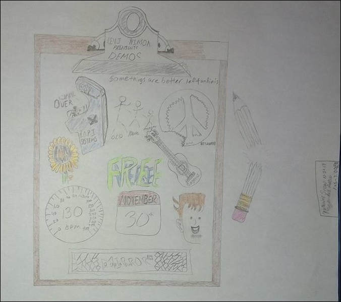
Levi Hinson
Demos
November 22, 2017
Behind The Art:
Two nights before Levi released "DEMOS", I saw the post about it dropping that Wednesday. I wanted to do something original and I knew just the thing. I pulled out my old clipboard and a broken pencil and got to work on a drawing of a drawing. I made references to Our Internet Friends (the now dead collective consisting of Levi, Drew, Kevin, Andrew Mulat, Cullen Livingstone, and Alex Vieyra) and Village Idiots (the collab mixtape with Drew Famous) [see the big head? Art was originally done by Alex Vieyra] . There are 14 songs on the project, but I left this art unfinished because some things are better left unfinish....
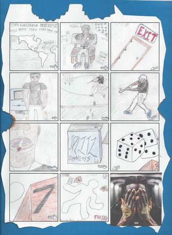
Topi Mandela
This Brave New World Made Me
November 10, 2017
Behind The Art:
When Topi Mandela first posted the cover art of the album, he said that he was going to release the album like a novel. (Actually, the album was based on the novel Brave New World
by Aldous Huxley.) This inspired me to make my own version of what Topi said and made a comic/graphic novel out of the art. I started with a comic book template from the internet and a cut-out of the album's cover art and went to work. The batter's, and the continents are also cut-outs because I didn't want to waste time by doing something I know that I am not that good at. The story from the art is that Topi is being chased by the two-faced thing (the :): thing) and how it is making his life hard. If you look at the bench Topi is sitting on, there's an advertisement about aha gazelle's mixtape, Trilliam 3 (which dropped the same day as Topi's album). Each square is a part of the tracklisting. The first square is the album name and the final square is the outside view of the thoughts going through Topi's mind. I had fun doing this and I can't wait for TBNWMM 2 or whatever Topi has coming next!
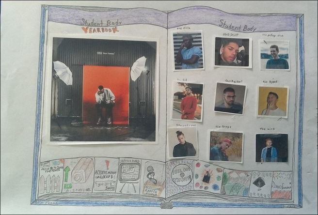
Drew Famous
Yearbook
October 27, 2017
Behind The Art:
Story coming soon...
Yearbook
October 27, 2017
Behind The Art:
Story coming soon...
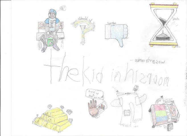
Adrian Stresow
The Kid In His Room
September 22, 2017
Behind The Art:
Story coming soon..
The Kid In His Room
September 22, 2017
Behind The Art:
Story coming soon..
Adrian Stresow
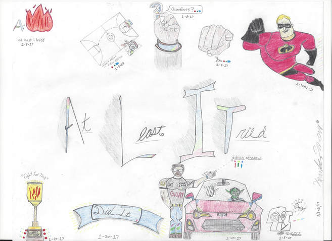
At Least I Tried
February 17, 2017
Behind The Art:
I was motivated to create something cool for Adrian's album. I considered what I would do for the art and I finally decided what I would do after the tracklisting was posted online. I started on the art track-by-track until I finished. The most challenging parts was the Mr. Incredible and Toyota FR-S art pieces. If you have a copy of The Incredibles (2-Disc Collection) on DVD, the art for Mr. Incredible is based on the Disc art for Disc One. The trickiest part as I mentioned was the Toyota FR-S and Master Yoda for the track entitled "Yoda" on the album. Having to draw from two pictures and then combine them was the most difficult part of this project. All the art [except for the 'A' in the "At Least I Tried" (simply put as ALIT) drawing, the drawing for "GOAT" (The lower half-from the waist down-is a modified Super S Stussy), and the art for "Hard To Tell" ] is based on images searched online. The Album's title and artist name were placed in the center actually as a filler for the page. But at the end of the day, we got something great...oh, and a Quote Retweet from the artist, Adrian Stresow.
